The New Balance 990 is probably our favourite range of silhouettes that New Balance offer, whether that’s v2, or v4, we are fans of them all, and when the 990 was first released back in 1982, 34 years ago, it was the first $100 running shoe to hit the market.
When it was first introduced, it was at the absolute peak of running shoes, and although there might now be 100’s of running shoes on the market, the 990v4 still holds it’s on with it’s pigskin and mesh upper, motion control device, and the excellent Encap cushioning unit.

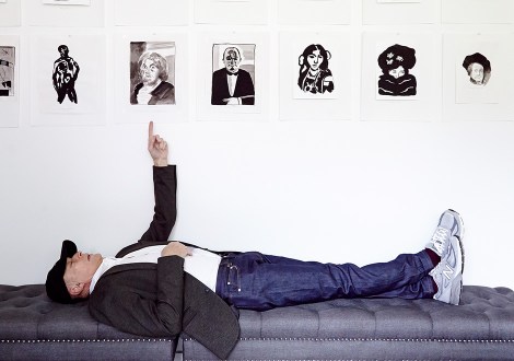
Check out this extremely cool video about the New Balance 990v4, featuring Terry Heckler, the guy who designed the logo.
In celebration of the release of the updated New Balance 990v4, the good folks over at Sneaker News sat down with advertising and design legend Terry Heckler, and talked about his longstanding 40+ year relationship with New Balance and owner, Jim Davis.
“I recall my first conversation with Jim. He told me that he had a little shoe company based in Boston called New Balance and he was trying to figure out whether to keep or change the name. I looked it up and thought, holy smokes, they’ve been around a long time. I said ‘Hey Jim, why don’t you keep the name? It’s been around a long time and we can work with it.’ He said ‘You’re the first marketing person who recommended keeping the name, so you’re hired.’ That’s how I got started with Jim.”
The first project Heckler Associates worked on was creating the “N” logo displayed on the sides of the shoes. Prior to his design influence, New Balance shoes featured three stripes on the sides, which offered support, but not brand identity. Heckler recalls, “I said to Jim, ‘We have to fix this right away. We need something that refers to the New Balance brand.’ We got rid of the stripes and diligently worked on trying to get the corporate logo to work on the side of the shoe. The ‘NB’ took up a lot of space and then you have the speed marks in the N. Technology and shoemaking at the time just couldn’t handle that level of detail, so we just worked with the ‘N’ and it was cool. It looked good and sat well on the side of the shoe. It occupied the saddle quite nicely and provided as much support as the three stripes did.”

